Healthcare
Moderna
Role
My role was Senior Visual Designer. I was the only designer for this product but I worked with a copywriter on the correct UX copy for Moderna.
Scope
Led, pitched and designed Moderna presentation material and statistics in a mobile-first experience.

Background
Reimagining Moderna’s presentation material into an informative, immersive landing page was complicated. Moderna came to use as a company that has decades of technology and research but to the public, Moderna is just a COVID-19 vaccine company. Our job was, first, to change users' minds by illustrating the long history of scientific solutions and practices Moderna has implemented. Given the heavy nature of the material and Moderna’s willingness to give us creative reign, I aimed to create a landing page that felt lighthearted and explanatory.


Ideation
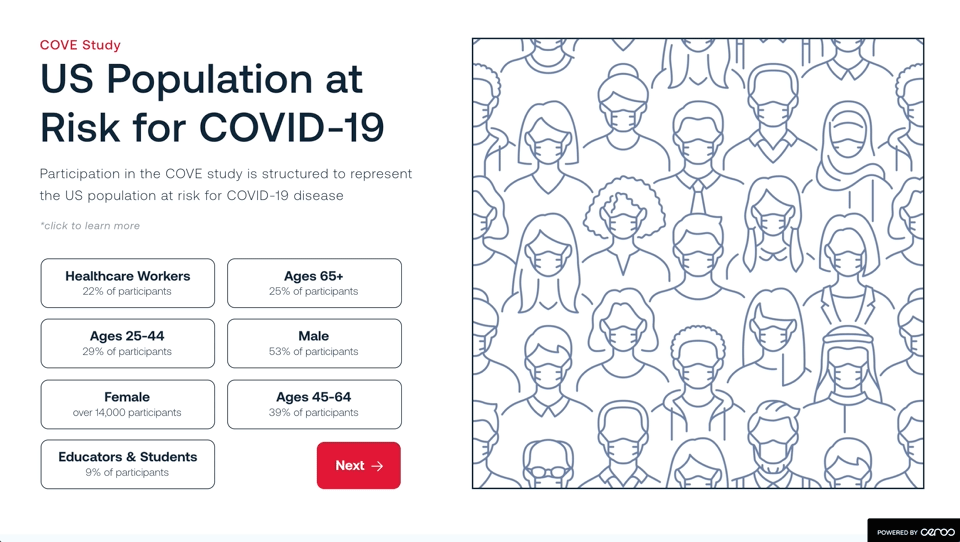
The source material was presentations, statistics and scientific articles. It fell on my to read and understand the source material then establish user flows and journeys to present to Moderna. The material focused on the Efficacy and Safety of the mRNA-1273 SARS-CoV-2 Vaccine, Risk Demographics and more.
Scientific and Analytical Design
Science has always interested me. Scientific illustrations, intimate images, and graphic photos of sensitive material have always been complicated to use. The imagery needs to be presented in a way that doesn’t displease the user but more importantly, gives users an accurate portrayal of information.
Education
Researching, dissecting, and comprehending mRNA wasn’t in my specific wheelhouse. But it was important for me to have a basic understanding of the material to depict it in its simplest form. This piece was Moderna’s introduction to Ceros, all imagery and components were sourced-recreated by me.
Analysis
Fragmented experiences and singular storylines were discovered by my team during the kick-off call. All information was in PDF form, material buried within their site or seemingly required credentials to access. Our team proposed taking control of the narrative and pull data points that could be viewed by anyone.
Data Visualization
After presenting my sketch and prototype to Moderna, I needed to make all these learnings relatable. Instead of displaying the numbers as numbers, I decided to humanize all data points. Moderna wanted that human feel but didn't want to lose the scientific specifics. This led me to focus on the COVE Study and the basics of mRNA instead of creating another central place for 100's of links.
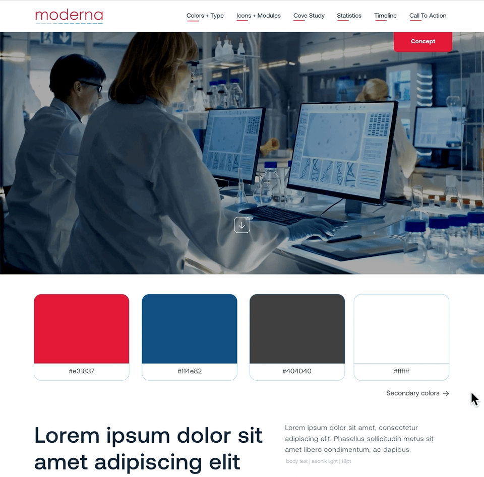
Creating UI Kit
I'm a client's first introduction to the program so taking static branding elements and creating an interactive branding guide/UI kit is vital to integrate them into Ceros. Moderna's concern was their current UI felt as heavy as the topic. The solution was in rounded edges, inverting the colors, focusing on cool blues and adding gentle interactions only where necessary.


Solution
Modernization of Moderna
The separation of past, present, and future was important to Moderna. This separation is established through the dynamic content within sections but united through toggles and common user interactions – such as the commonality of hovers and the iconology that we established.
Mobile First
This experience was meant to be referenced every and anywhere. My team decided to focus on mobile above desktop.
User Tracking
After shipping this product, we suggested tracking user drop-off and using that information to prioritize information across their site.